Best Ecommerce Website Design doesn’t require a ton of technical skills to build a website. Because of the number of ecommerce platforms available today, you don’t have to be a coding expert to build a useful online store. The platforms take care of the heavy lifting for you.
What Makes a Design Good?
Consistency
Best Ecommerce Website Design keep a consistent design across all the pages on your website. You can use a different layout for product pages than your blog and other web pages, but the color scheme, navigation menu placement, etc., should remain the same.
Use the same fonts, animations, color palette, logo placements, and so on to keep the responsive design consistent across the entire website. It creates a cohesive brand and is necessary for great ecommerce web design.
Visual Appeal
Visual appeal is critical since people cannot physically browse the products of your online business. You want your customers to be able to see themselves with your products. Your website visitors will get their first impression of your online store within a few seconds, so make it eye-catching.
You need high-quality images and help product information because customers can’t touch or try your products beforehand. The visuals will help people decide if they want to make a purchase. Use a combination of product images against a white background and lifestyle shots that show your product in use.
You’ll have guidelines to follow when selling on a third-party website, such as an online marketplace. With your own website, you’ll have complete control over your storefront.
You’ll also want to choose a limited color scheme that’s easy on the eyes. Too many colors or bright clashing colors will turn people away. You want the main color and an accent color to create some contrast. You want a font that’s easy to read. And lastly, you’ll want to ensure your website is accessible to those with vision and hearing issues.
Trust Signals
If you walked into a retail store and found it messy, with employees standing around talking as if you weren’t there, would you continue shopping or head straight for the nearest competitor?
When someone visits your online store for the first time, they likely don’t know much about your brand, product quality, or reputation, specially if you are a small business. Promotions may make them consider you, but you have to earn their trust before they convert.
People need to know that when they purchase from you, they will receive exactly what you advertised.
That means having trust signals on your website, such as:
- Contact Information – Physical address if you have one, email address, phone number, etc.
- Return policy – Show people that you will accept returns if they’re unhappy with their purchase. Set expectations from the beginning.
- Trust badges – Demonstrate your website security with multiple payment methods and security seals.
- Social proof – Customer reviews, testimonials, etc.
User-Friendly Navigation
Website navigation is crucial to making your website to be Best Ecommerce Website Design. Not only does it ensure customers can find what they’re looking for quickly, but it also helps with search engine optimization (SEO). Your site should work well on computers and mobile devices alike.
Good navigation sets the tone for a positive online shopping experience. Keep it as simple as possible, and ensure you have a smart search function that will pop-up to help people find what they’re looking for.
For instance:
- Home
- About Us
- Shop (with a sub-menu that lists out product categories or a menu that individually lists out each product category.)
- Contact Us
Include a variety of payment options so shoppers can choose the one that’s most convenient for them.
10 Best Ecommerce Website Design
1. PopFit
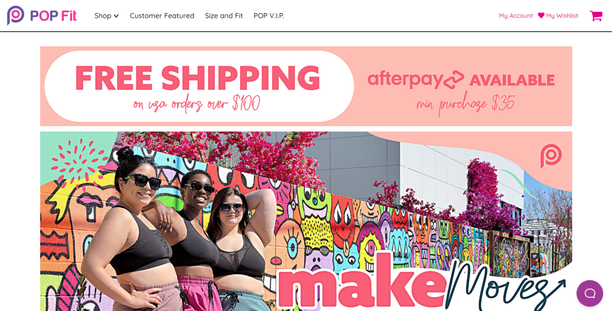
PopFit Clothing is an athletic clothing company for women, specifically designed to provide comfortable clothing that won’t ride up during a workout. They use bright and bold colors and highlight real women of all shapes and sizes, to showcase how their products work for all bodies.
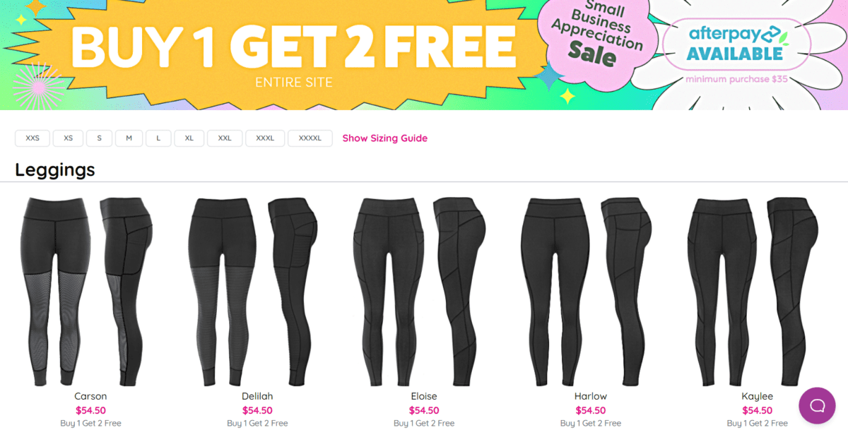
PopFit has product category pages for each item they offer: Leggings, Joggers, Crops, Tops, Shorts, Sleep Sets, Underwear, and Accessories. Each product category page lists each item, along with sizing filters to help narrow down choices quickly and easily.
2. Helbak
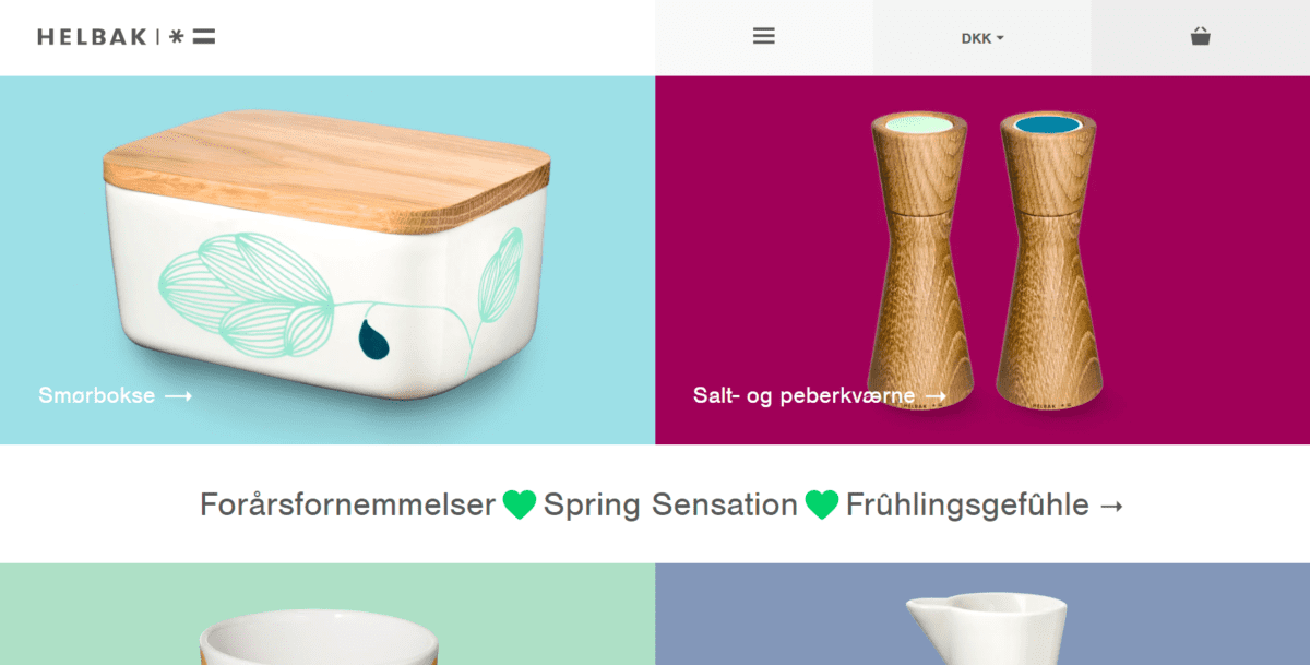
Helbak puts its products front and center with a minimalist design and a bright color scheme that doesn’t make you feel like you’re looking directly at the sun. The overall design is clean, which creates a classic look that highlights the products.
3. Decibullz
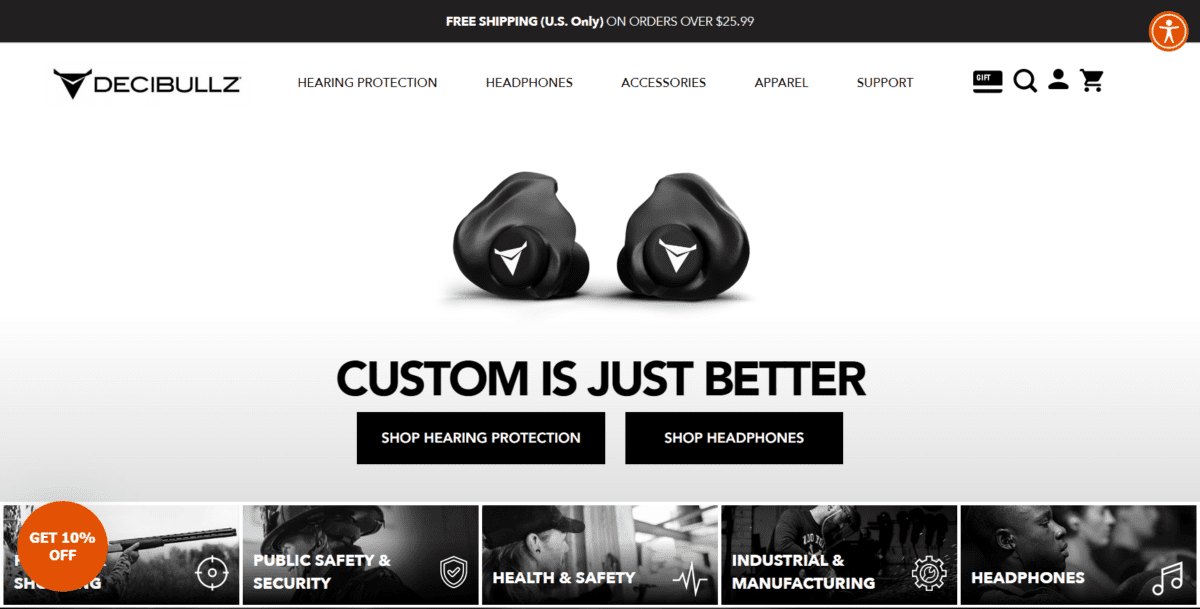
Decibullz offers a great example of how you can use larger images successfully. It requires a fast website since the image files are larger. While many websites on this list use color successfully, we love that this one is just as beautiful even though it uses primarily black and white. The contrasting color makes it easy for the call-to-action buttons to “pop” off the screen.
4. MeUndies
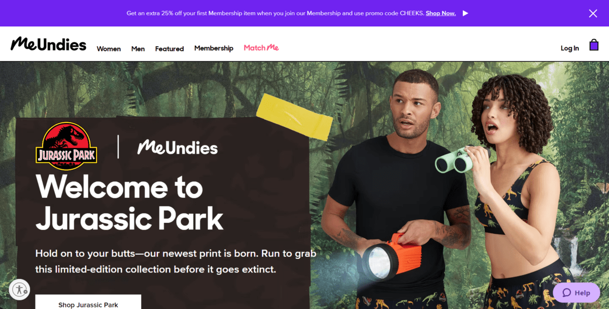
MeUndies is an excellent example of how to use color to show off your products. A predominantly black and white color scheme makes highlighting the products easy since they are colorful.
You won’t find white space on the homepage design, but you will see it when moving to select something from the product pages. A mega menu option highlights the products visually and through text, making this well-designed website fun to visit and an easy-to-use shopping experience.
5. URevolution
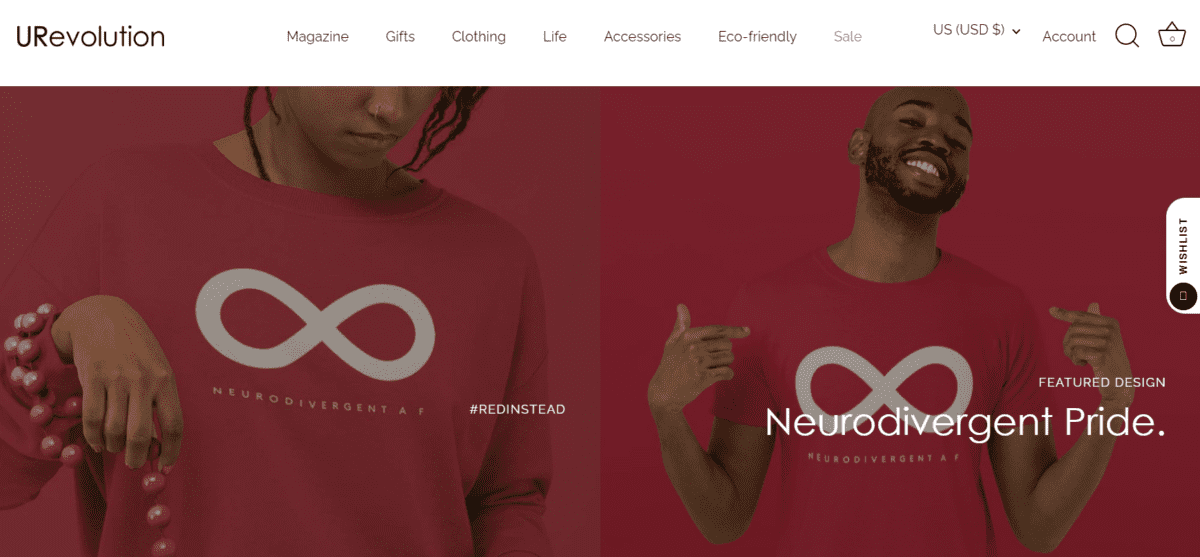
URevolution is a clothing line dedicated to making a difference. Focused on inclusion, body positivity for every body, and eco-friendly products, this Black, disabled, woman-owned business is taking a stand. This brand stands for making a difference, and the website design makes it easy for everybody to purchase products and share their experience. The design highlights the products using real people, not just models.
6. Warby Parker
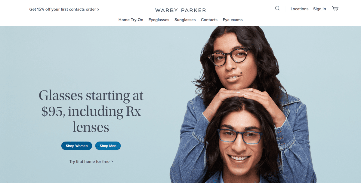
Warby Parker is a popular online glasses retailer and one of the Best Ecommerce Website Design. The clean design makes it easy to “try on” various pairs of glasses before committing to the one you want to buy. Product photos clearly display what the glasses look like and the home try-on option gives shoppers reassurance before spending their money. The navigation is clear – simply choose the type of eyeglasses you’re looking for, then choose whether you’re shopping for men or women.
7. Dick Moby
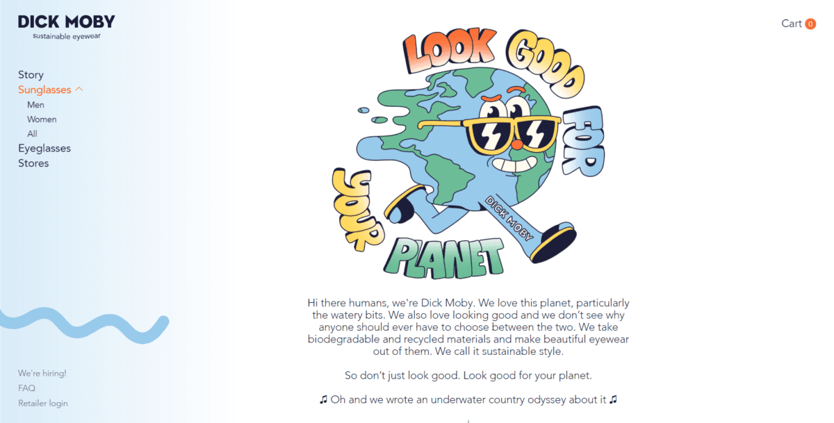
Dick Moby goes against the grain a bit. Most of the websites on this list use a combination of color and photography to set their brand apart. Dick Moby adds a bit of fun with partners to really customize the feel of their site. The one thing that’s immediately clear about the brand is its eco-friendly stance.
8. The Mountain
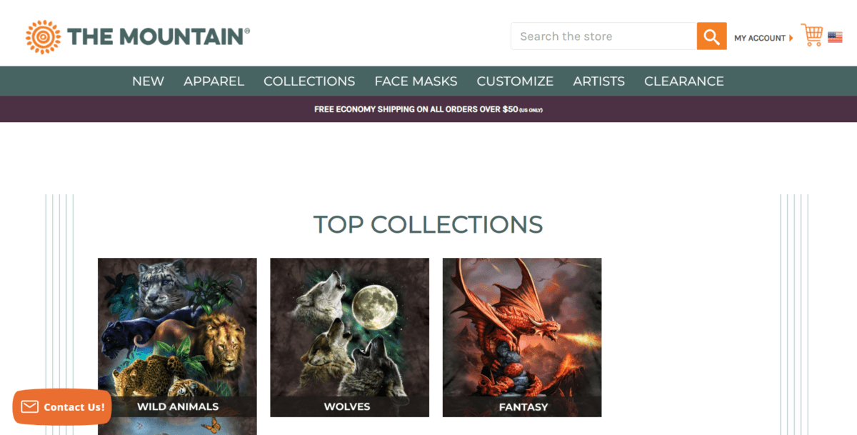
The Mountain is another Best Ecommerce Website Design that was one of the finalists for the best overall design. They use a basic color scheme that allows the product images to really stand out. The navigation is simple, but the search bar makes it easy for people to find whatever they are looking for.
9. Frank Body
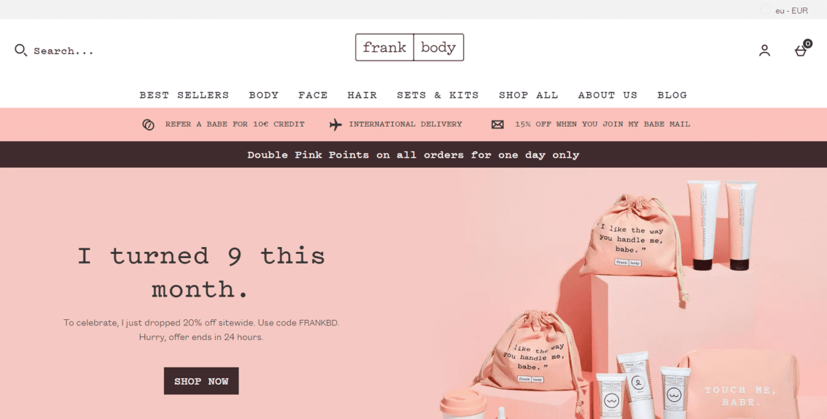
Frank Body is a health and beauty website that perfectly demonstrates how a monochromatic color scheme can work to build a striking brand. Another thing that really stands out about Frank Body is their quality copy.
10. Leaf & Clay
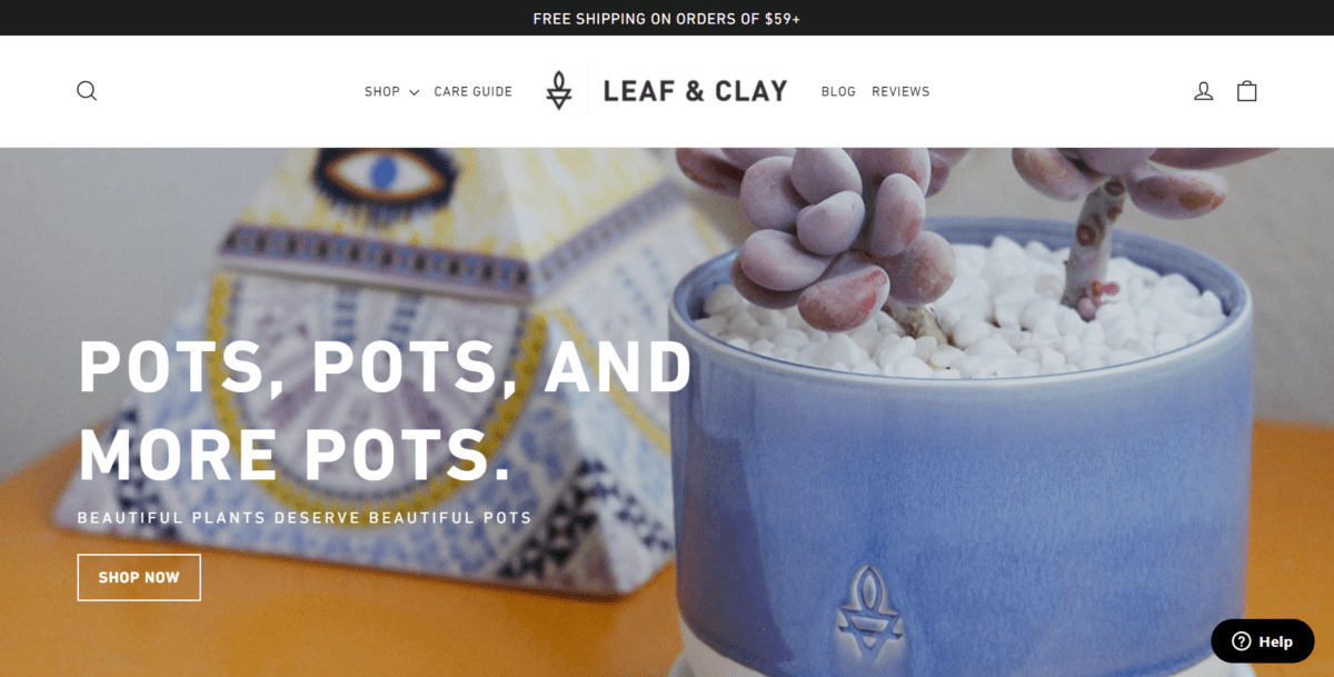
Leaf & Clay is a plant company. Their ecommerce store is easy to browse through just from their homepage. It breaks the site down into various categories by plant type, such as cacti, low light, weirdos, rare cultivators, new arrivals, and best sellers. Clicking on the category takes users to a list of plant products that fit into that category, so even those with a brown or black thrumb will be able to find plants they can keep alive. What could be easier than that?

